Showing posts with label interior design. Show all posts

Wednesday, August 14, 2019

The End is in Sight


Insulating the walls
Drywall up,  Studio is Ready for Taping.

When we started phase two (about 2 months ago) of our project, we were busy with the insulation work.  First we blew insulation into the attic then we started the tedious task of wall insulation.   After the insulation then Al commenced with setting the drywall in place.  We have built enough places together to know that neither one of us wanted to do the drywall taping so we hire that process out.  Taping is a very time consuming process and if not done correctly it will show when you paint the wall.  Once the taping is done, things usually go much faster.

I started looking at hardwood flooring in late May and finally ordered the flooring in June.  It took me several trips to a variety of showrooms before I found what I liked.  I knew it would take awhile because I was dead set on several elements: I wanted a light, wire brushed hardwood,  no less than a 1/2" thick, and it had to be at least 5" wide. I found what I wanted at Worldwide Carpets on Route 1 in the Lawrenceville area of NJ.  Even though it came from Canada, it took around 6 weeks to arrive.  After allowing it to acclimate for a week, I laid the pattern and Al was behind me snapping it into place.  It's a floating floor so there aren't any nails or glue to adhere it to the plywood.  We will be placing the baseboard later, but having the hardwood floor down was a big step towards livability.

As a DIY designer, I like being involved with the project as much as possible.  It all adds to my knowledge base, but takes time, so you may not see any post from me for awhile.

We still have much of the finishing work to do, but the end is in sight.


Friday, April 5, 2019

Color My World


Granite Gray
Colbalt Blue
  I am immersed in the world of color these days and I'm loving it.

Color is a subconscious language.  We are all effected by color, even when we don't realize it.  Each color has it's own influence and creates a physical, mental and emotional response within us and that's what makes the topic so interesting.

The are many approaches to choosing paint colors. When you decide to paint a room  in your home  a good approach is to fine a piece of art or fabric or some type of accessory that you can use to harmonize or contrast around for your new color scheme. But you always need to be mindful of adjoining rooms.  But for new construction I find that approach limiting.  For this project I am using the same approach that I used when we built our house back in Springfield, IL. 

My approach includes working with the total space first.  This means that I have subdivided the  condo into three color distribution components:
Dominant Tier:  wall, floor, ceiling;
Middle Tier:      cabinets, curtains, large furniture areas; 
Smaller Tier:     smaller spaces/accent areas

Choosing the color and sheen can be a daunting task.  My first decision is always about color temperature: cool(blue, green, purple) vs. warm(red, orange, yellow) color scheme.  Once you decide on the color temperature, the world of color explodes.  I've chosen a cool color scheme for the condo: vibrant blue and varying grays.

This is a 1100 square foot condo.  The main room is a big open space incorporating the kitchen, dining and entertaining areas. Paint colors for the dominant tier have been chosen, choosing paint colors for the middle and smaller tier are in process.

Most activities take place in the main area.  A traveling light to medium tone gray will be applied along the perimeter walls. The lightest part of the wall is in the kitchen area.  The kitchen has base cabinets only which I have painted a darker gray than the light gray wall.  To contrast gray and make the colors pop, I needed a dynamic item.  For this I chose to paint the 6' island in the rich vibrancy cobalt blue in a high gloss sheen. When all is done in the kitchen, industrial shelving units will take the place of the wall cabinets and artistic tile will add textural subtlety to the backsplash area of the countertop.  Other colors will be brought into play as we move through the furnishings and accent areas.

If you are thinking of painting your cabinets, I have two pointers for you.  The first is that it is better to spray the paint on in contrast to using a paint brush.  You will most likely have to thin your paint but it will go on smoother and you can work through the process faster.  Hand painting furniture is  labor intensive and it's a joy to do if you only are doing a few specialty items.  I have brush painted a lot of tables and book shelves etc.  However, when doing a kitchen, I think spray painting is the best way to go. I would also recommend a gloss or a high gloss sheen for the cabinets. 

The second bit of advice is that wall paint is not furniture paint, is not
cabinet paint.  Kitchen cabinets take a lot of  wear from the everyday opening and closing activity and a wall paint is not up to the task.  I use Dunn Edward's Aristoshield product.  It's a low-VOC  enamel formulated with a water-based urethane alkyd technology for an oil-like finish.  Basically, it puts a more protective finish on cabinet doors and drawers.

This project is ongoing and as soon as the cabinets are installed I will add a more completed post which will include the cabinet pictures to the topic.  Unitl then, if you have any questions regarding color or the specifics of painting cabinets, just email me.  I'll be happy to help. 


Wednesday, April 27, 2016

What About Those Old Photos?

When I was a kid riding the trolley in Philadelphia, I would often miss my stop because the person sitting beside me was telling me a good story.  I am easily fascinated by people's stories and even today one of the best parts about being a writer and a designer is talking to people and hearing their stories.
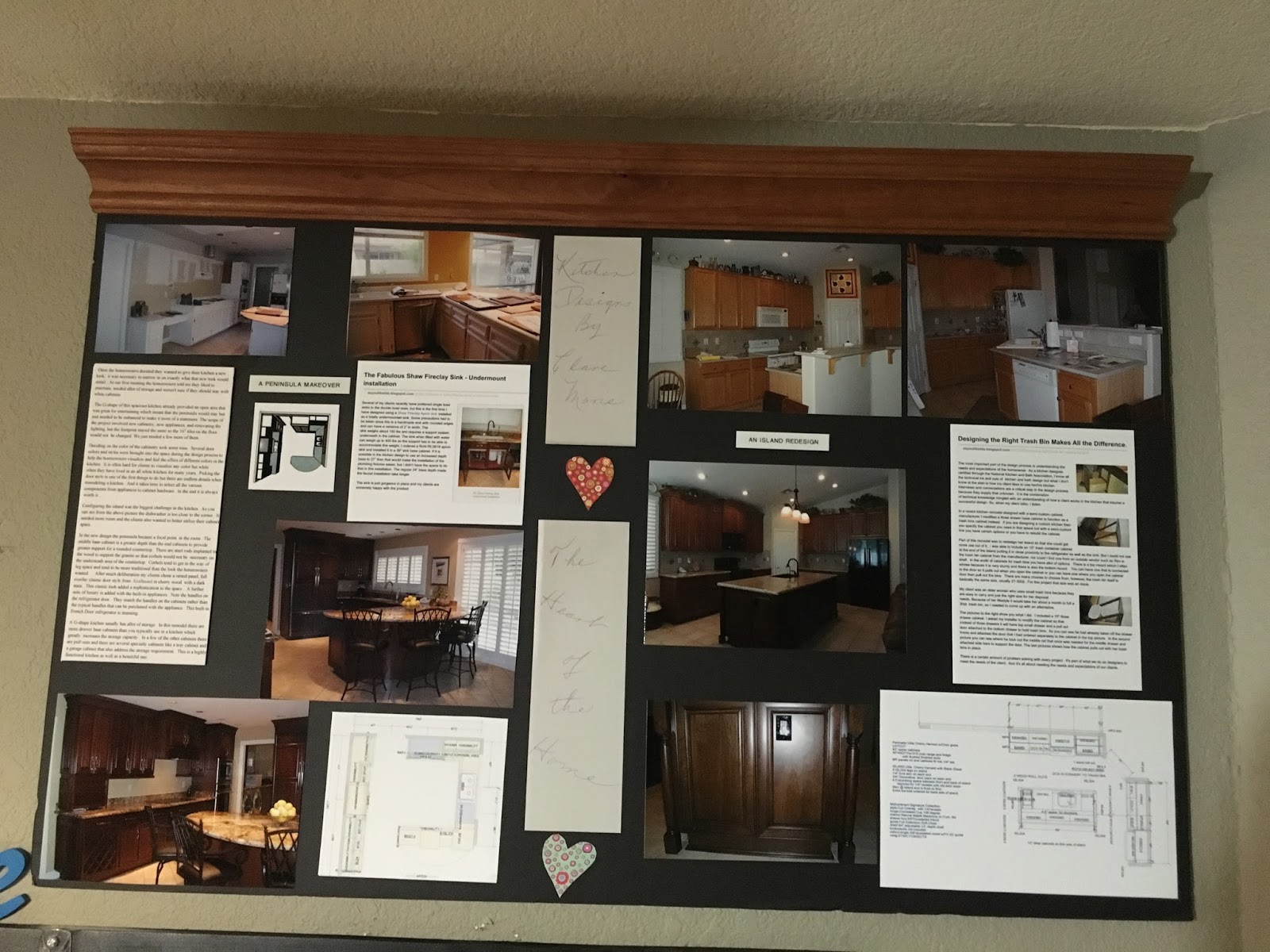
Project Picture Board - Two Kitchens

 It takes at least five working sessions with a client before the kitchen/bath design phase of a remodeling project is complete.  As those design details are being worked out, I am often privileged to be a part of their family conversations. I get to see old pictures and hear about their best vacations or the Dad that was a war hero.  And almost always the topic of clutter comes up.  Clutter is a real issue.  I have helped several clients go through cabinets and closets to dispose of items they never use.   But, the hardest part of clutter for many people is often those old pictures that tell the history of who they are and how they have come to be the persons that they are today.

After I complete a remodel I create a project board using before and after pictures of the remodeled space. And years later when I look at the board I can still place myself at their table and relive the telling of those family stories.  Those stories are priceless, yet, there is a very good chance those old photos will be thrown away and their history erased from memory.  This reality started me on the path to help people preserve their stories.

Getting rid of photos is very difficult but you don't need every photo to keep a memory alive.  You need to keep the most heartfelt ones, the ones that grab the person's personality and you need to join it with other symbols of that person's life to make the story complete.

In my story making plaques I use wood plaques and work with old photos.There is a risk in working with aged photos, especially glossy ones.  The sealers could streak it a little too much or may highlight any discoloration present in the photo.  I tend to take a picture of it before I work with it.  Many multi-media artist will reproduce the photo onto cardstock and work with that way rather than the glossy photo.  But I use the photo and keep the pic on digital incase I have to reproduce it for some reason during the process.  However, since de-cluttering is a part of this endeavor, the only physical photo is on the plaque.  I work on solid wood so it can be hung on a wall or it can sit on a shelf. The sides of the wood are painted black.

I am currently working on a demo for my P.E.O Sisterhood.  And probably in the fall I'll have a  workshop on the tools necessary and the preparation involved in creating wooden wall plaques. Plaques are more time-consuming then you may think.


The plaque on the right is about my beautiful sister Mary who died a few years ago.  That's my favorite picture of her as a young girl.  She was my oldest sister and was born in Cape May so I put the Cape May light house on there along with other references that speak to her life.  She was pretty amazing.


If you have photos where you just want to highlight the picture then just painting or distressing the wood as I did on the left may be what you want to do.  I don't like frames so I have a variety of ways to display my photos.

Other methods for preserving memories are scrapbooking using acid free products and creating a board as a poster then protect it with plexiglass.  I have used this method with old photos. Another way is to just put everything on digital software. 

Whatever method you choose, preserving memories is always worth the effort.  Enjoy the process.


.

Sunday, April 17, 2016

The DIY Designer - Insulating the Attic

 
As a do-it-yourself designer I often work with clients who also want to do the work themselves.  They sometimes just need someone to work out the design, help with product selection, guide them in the process and keep the project moving.  Although I am predominantly a  kitchen and bath designer, I get a variety of questions from my DIY clients.  Questions range from How can I get more use out of this spare room? and How do I paint my kitchen cabinets? to How can I get rid of  all this clutter? and How can I soundproof this room?.  Last year one of my clients asked me about insulation.  From a builders presentation at KBIS, I had some current knowledge about insulation but  I still asked a builder friend of mine before passing on any information to my client.  Well, Saturday morning we worked on blowing insulation into the attic, so I got to use some of my own advise and leaned more in the process. It took about an hour and a half.

While Al was in the attic with the hose blowing in the insulation, I was breaking up the cellulose insulation and filling up the blower.  It's messy work, hard on the back but I wouldn't classify it as hard work.

When we built our house sometime ago we used panel insulation.  It was a bit overwhelming because bits of fiberglass would cling to my clothing and would find their way to any exposed skin I had forgotten to cover up.  But this process was a whole lot easier.

Setting the blower up was easy but you have to do it correctly for it to work efficiently.  The bigger  gauge(wire) and the shorter cord seemed to work better.  The blower will shut itself off from time to time if something isn't connected correctly.  Or it may not start at all, depending on what is wrong with the connection.

 
Once you are up and running, the process is simple - just keep everything moving and never put your hand down in the blower. You will have to stop from time to time though to sweep up the fibers that got away and to drink some water.

The blower works better when you break up the cellulose into small pieces, the bigger chunks take the blower longer to process.  This fiber material is not the old fiberglass material, this is an 85% recycled material made from newspapers that includes a fire retardant.  However, you still need to wear protective clothing - gloves and a breathing mask for sure. You do not want to breath in this stuff.  I don't think I would do this if I had asthma or any respiratory issue.   As with any project you endeavor always read all the instructions first.

So, that project is done.  Onto the next one.

Wednesday, December 25, 2013

Sunday, May 26, 2013

From the Woodworkers Shop - Lofty Ideas Installed


This is the installation of the bunk bed unit that I mentioned in a initial  post: From the Woodworkers Shop - Lofty Ideas.   It took roughly 5 hours to install and the clients are very happy with it. 

Below the unit is pictured with the daybed in place.

Wednesday, April 24, 2013

I Spy With My Designer Eye...

Recently I accompanied my husband on a business trip to San Diego for an Informix Conference. As an ex-IT professional it was fun to attend the evening events but the designer in me quickly emerged.   As talks about various software packages continued I found myself engaged with all the color, lighting and music  components engineered to make this a successful event.   And the food, of course.  Food, at any event, always matters.

It's fascinating what you can do in a commercial space that you can't really do in a residential environment.  It's the fact that the size of any space effects the scale and proportion of the elements that you can use within the space.  Let's look at the rug for instance.  The huge geometric figures and the pattern would be too busy in a residential living room but in a commercial space its whimsical and unbeat and fits quite well.


The lights are also very complimentary to the conference room.  The copper, mica and wood elements  bare the imprint of the Arts and Crafts Movement which so dominates the California architectural style.  Thanks to the Greene Brothers and the Pasadena influence some of the best examples of  the Arts and Crafts period in America such as the Gamble House can be found  in California. 

The young performer for the evening was +Trent Hancock.   Singing a variety of old tunes, plus a few of his original tunes he totally engaged many of the attendees with  his smooth and clear vocals as well as his easy style.  A sample of his style and  performance can be heard on this webpage: http://www.reverbnation.com/trenthancock#!/playlist/view_playlist/-4?page_object=artist_903652.

As with any business conference there are usually little gifts from the vendors.  My favorite was a tin of the famous London phone booth with about 20 English Breakfast teabags given to me by Mehdi Afshar of Querix Europe which is homebased in the UK.  My designer eye caught this tin from across the room.  That's why Sir Giles Scott designed it using the color red. Red is an attention getter. 


Friday, April 12, 2013

In the Woodworker's Shop - Lofty Ideas

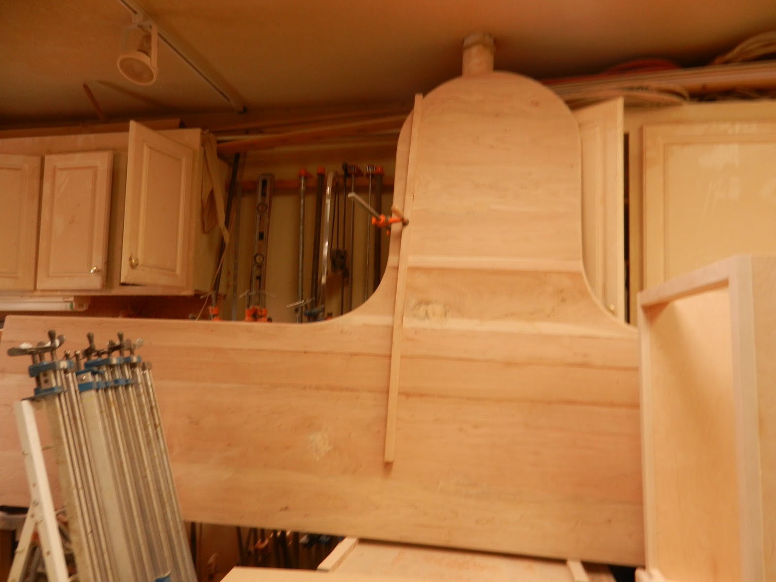
When you need to increase your usable space and you have high or vaulted ceilings, the best way to go may very well be up.  That was the decision of our current clients when they realized they needed an additional sleeping area for the children, but adding on another room was not possible.  Our current project in the shop is a pair of bunk beds resting 6' off the floor above two armories.

There are many parts to this project: two armories, two platform bunk bed, shared headboard with electrical outlets and an opening on both sides for books and accessories, two ladders and supporting pieces.  When it is installed I will post a picture but for now it's still a work in progress
The Armories
Two ladders


Shared headboard with electrical outlets


Fitting It All Together


Saturday, March 16, 2013

Modular Rug Designs

 Would you like to design your own rug?  This material  is made of 100% recycled nylon. It's available through Flor Carpet and allows you to create your own design using square carpet tiles.   Basically your rug will start with a 20"  square that is easily connected through a FlorDot adhesive to another square  tile.  You can make the rug whatever size your  space requires.  You can do runners and wall-to-wall rugs as well as custom rugs..  You can mix and match patterns and color or just use one tile interchanging between vertical and  horizontal in the design until you have the right number of squares to make up the rug size. 

 Flor Carpet has a showroom located in the Scottsdale Quarter in Scottsdale Az.  They have sample rugs throughout the showroom, just keep in mine that Flor Carpet recommends their usage only on the floor. 

Tuesday, March 12, 2013

The World is Going Gray

I have several clients who have all decided that this year is the year to paint their interior spaces.  And so far gray is the number one color of choice.  It appears that the color gray has finally become mainstream.  The attributes of gray or grey, if you prefer that spelling, make it a great neutral color. 

A basic gray is a combination of black and white, but there are lots of ways to create this neutral color.  That's what makes the color gray so fascinating.  It can be created through a combination of any of the complementary colors or  a combination of the primary colors: red, yellow and blue.  And depending on that combination it can be a cool gray having blue, green or purple undertones  or it can be warm gray meaning it has beige undertones. Regardless of its category, all shades of gray can be used as a background color to add depth and definition a room. 

As a kitchen designer I've used lots of gray in the color palette of my kitchens.  A cool gray creates an elegant statement in a kitchen that has stainless steel appliances, brushed nickle hardware and a carrara countertop.  The one situation where I don't tend to use this neutral on walls or backsplashes is if the floor or the cabinets are slate in color. Too much of the color could make the room appear  dull and maybe dreary.  Gray needs other colors.  It will support the other colors. It will be influenced by the other colors.  It needs splashes of red, orange, blue, green to enhance its effect.

A cool gray will always appear to lighten the room.  It will never create a heavy feeling in the space.  Recently one of my clients expressed surprise when I put Dunn Edward's Smokey Mountain paint on her living room wall.  "Oh, it still feels lite in here."   Yes, cool gray does that, even when you are painting over a white wall.

A warm taupy gray has a much different effect.  This neutral goes well in a room where you want a comfortable atmosphere for conversation. A warm gray which is also referred to as a French Gray has the red, orange  and yellow undertones and creates a feeling of warmth in the room.

It takes hours to choose paint colors so don't get frustrated with the process.  I don't meet my clients at the paint store, instead I carry my 5 x 7 paint samples to the clients house to help narrow down the colors.  Dunn Edward's Paints are specifically made for the southwest environment and I am comfortable recommending their colors to my clients because  they are eco-friendly and provide a superior quality paint.  At the first meeting I always bring the Cool Neutrals and the Warm Neutrals samples with me.  After we are comfortable with the choices made I'll buy the sample size and paint splotches on  various walls so that my client can experience the color through the day and night light cycles.  It's a process that takes awhile especially if you are doing the whole house. 

Some of Dunn Edward's most popular gray paints:
Smokey Mountain  DE6386
Dangerous Robot DE6387
Porpoise DE6373
Covered in Platinum DE6367


Friday, March 8, 2013

The Two-Person Office - installed

I love the difference it makes in someone's life when you take an empty space and covert into a space useful in their life.  Below are pictures of our latest custom project.  Construction of this desk can be viewed on my post: In the Woodworker Shop - the 2 person office.


From This


To This
The top of the desk is cherry wood with a walnut stain.  The crown molding is also cherry with the walnut stain. Shelves and cabinets are maple wood with the walnut stain. 

Monday, February 18, 2013

In the Woodworker Shop- a 2 person home office.

Behind the scenes in the woodworking shop, a two person desk for a home office is on its way to completion.  This past weekend we took a sample door to the clients so they could verify the finish  before the furniture can be completed.   As I work with another client regarding her kitchen, the office is being constructed and the next project which is a loft will commence after this office is installed.  Before any of the construction begins though there are CAD drawings created and presented to the client so that we are all on the same page.  We use the drawings to talk over the design with the client.  Changes can be made up to the time of construction.  A big part of my job other than designing is to make sure it all flow smoothly. 


The Office in Raw Wood, before the stain:

This desk top is 167" and has a rounded desk area for additional counter space. 
The   pedestal will sit beneath the rounded area

Shelf space

pedestal for beneath the desk

Raise panel doors

Wednesday, February 6, 2013

The Art of Designing with Books

As a designer and a bookwoman I am fascinated by the way people display and care for their books.  As an avid reader and book collector I have more than a 1,000 books in my home, so books and book related issues are always a part of my consciousness.  Over the past few years I've given some away to other readers so that I can, of course, buy more books.  It's an addiction, an obsession, a passion and it's wonderful. 

Book people like seeing their books.  It gives us a feeling of comfort, of warmth and a sense of being home and surrounded by old friends.   We tend to have books  in every room of the house as well as a home library.  If this is the case then you need to decide if you want them to appear as clutter or as decorative art. A wall of books can furnish a room and look like a work of art or it can be a disorganized nightmare.

Regardless of where books are in your home they should be kept our of  harms way.  There are three elements that can damage books: dust, sunlight and moisture. That's why you often find collectibles behind glass doors or wrapped in Mylar.  Another aspect that comes into play is how to estimate shelf size for books.  I prefer 24" wide shelves but as long as you don't go further than 40" you will be fine, but books are heavy so keep that in mind.    As a point of reference you can get about 10 hardback novels on one linear foot of shelf space, oversized hardbacks will yield less and paperbacks about 18 to a linear foot.   If you just want shelves for paperback and trade books only than a 6" to 8" shelf depth works, otherwise a 12" works better.  However, in a office I often  design   13" or  14" depth  shelves depending on the storage needs of the client.  Binders require deeper shelves.

The purpose and shape of every room will dictate how you can display your books in that oom.
 In a large room bookcases can ground the space and add warmth to the room. Bookcases are fabulous because they can store a great deal of books. If the room is too narrow for a bookcase then another option would be to build small, maybe 4", shelves to be used only to display books with fabulous bookcovers placing them with their fronts facing the room similar to placing plates on a plate shelf. Then paint the wall that's behind the shelves a richer color than the rest of the room.  There's all kinds of options but available space is the key.

 In a small room books can be artistically arranged  on an unused surface areas like a built out pony wall.  They can also be arranged on any extra side tables you may have in the room or you can stack them high enough to create their own  table and place a small art object on top.  I would be conscious of creating piles that look appealing, meaning maybe you want piles of the same size or of the same color.  Color is an interesting away to arrange books though not a very functional one.  But as an accent, arranging by color can add drama or jazz to the space because that is what color does.  Another option if you have limited wall space and want a book shelf than you may be able to incorporate bookshelves around the entry door of the room, the window in the room or around the closet door. 

Displaying books randomly around a room is much different than arranging them in a den or a nook dedicated to reading.  In a dedicated area you must decide  how you want to organize your books.  You need a system that best works for you whether it's author within subject or just by subject or by reading date.  Use whatever system works for you and understand that no system is perfect and that  you will still wander around wondering where that book is that you just had in your hand.  It happens.

Arranging books on a bookshelf is an artform.  Take time with this.  It's like hanging pictures on the walls.  Do you like the look of a straight row of books?  This works well in a traditional library.   Do you want to break up the row with pictures or art objects?  Do you want them arranged high to low or by author within subject only?  Do you prefer floating shelves randomly placed around the room?  However, you arrange them just make sure you can get to them.  This is fun but it does take a little time.  If you have collectibles then you may want to go with glass doors, Mylar covers or maybe a climate controlled room.  

If you have any questions please feel free to contact me via my contact page.. In our business we build allot of bookcases for rooms as well as build-ins for those nooks around fireplaces and other places in the room.


Wednesday, July 11, 2012

Re-thinking your space - the multipurpose room

Over the last few years the trend for baby boomers has been to stay in their home rather than to sell, move and adjust to a new community.   In the case of the empty nester that often means making the back bedroom into a multipurpose room that they can enjoy all year round and still have available for  guest or when the kids come back to visit. While other homeowners may decide they need just a little more space so they add on an additional room to serve a specific purpose. Our latest project gave us an opportunity to work with a husband and wife who are having fun making their  new room addition work for their current lifestyle.
                     
A project like this is exciting.  It's fun to work with people and it's fun to listen to their plans for their home.  The needs of the homeowner is what drives any project.  That usually means there are several meetings before any construction can begin.  The homeowner has to decide on the wood species and  finish they prefer and exactly what they want this piece of furniture to do for them.  Do they want drawers, do they need lights?.  Because of the size of this wall unit (190"w by 109" high), the first part of the project was to build the custom furniture and install it. 

This is a queen size Murphy bed flanked by drawers and cabinets on both sides. The bed sits back so that we have some room for a shelf which is also used as a support for the bed when it is down.  There is a budget decision for the homeowner when it comes to the pull down mechanism.  You can have a manual pull down which is not very difficult or a remote control mechanism that does the job. 

As you can see there are lights in the top that will showcase pottery and books when the room is completed.  There are also lights at the top within the bed area so that people can read in bed if they want.  The base cabinets are 24"deep cabinets with full extension undermount glides for the drawers.  The wood species is alder with a fruitwood stain and a warm glaze.

With that wall in place it is now time to focus on the other side of the room.  


Thursday, April 26, 2012

The World of Textiles


As a designer I am constantly attending seminars and training sessions for products that I can incorporate into designs for my clients. Last week in Scottsdale, Crans Balwin, President of Donghia, gave a uplifting talk with supporting evidence showing that things are getting better.  In his talk he commented that "foreign money is  flowing into the US because we are a safe home for money."  Over the last month I have read several articles in the Wall Street Journal that expressed this same reality.  From a global perspective, investors find the US a safe market for their money.

After Mr. Balwin's talk he showered the attendees with an array of new fabrics coming from their SACHO and Rubelli textile collections. Fabulous, fun fabrics.  Large patterns, bold colors and whimsical motifs.  These pictures show the variety of fabrics - silk, linen, velvet, cotton, trevira which is a heavy use fabric that handles well the wear of everyday living.   I love to involve fabrics in my wall decor designs and large patterns play beautifully in rooms with tall ceilings as well as in commercial spaces.  Donghia has a variety of textured wallcoverings that are also appealing to use in wall art.  This presentation only addressed textiles, but they do have a fabulous array of wallcoverings as well.

While I only took a few pictures many textiles were introduced at this presentations. Below is a large  scale design depicting intersecting bamboo shoots which provide an abstract and playful image.  The fabric is named Flirt and the color is called Giggle Gold.


If you would like to visit this showroom or learn more about the new textiles just give me a call at 480-861-2711 or contact me through email whichever is more convenient for you.   You can also view  collections offered by Donghia at http://www.donghia.com/.


Wednesday, January 26, 2011

The Artists' Cafe


 This child’s table is one of the most fun furniture pieces that I have ever designed. It measures 30”w x 24”d x 19”h and has a poured resin top coat that you normally find on tables in restaurants. So it has a clear, hard and protective finish suitable for eating as well as for play activities. Whether designing furniture or rooms such as kitchens and baths, safety always needs to be the first concern.


The concept behind this design is to encourage a young child to explore the world of her own mind, the world of her own abilities and to have fun doing it. The tabletop is purple with the primary colors of red, blue and yellow as different parts of the table. I resisted the urge to create an elaborate, vibrant scene on the table because so often too much detail just gets in the way of creating something new. Drawing is like writing in the sense that it is better to start with a blank page. Since it's a table for coloring and drawing I included a color wheel in the shape of a house in the center with a small room as an insert. The insert is removable so that as she grows up the contents can be replaced with things that she makes or with something that is more engaging for her age group. On the left side of the table is a roll of paper so she can start with that blank page.

The design world is a world where possibilities come to life. It’s a very rich world, not in terms of dollars and cents, but in terms of color and creativity and it all starts with a concept. This child’s art and craft’s table is a good example of the process a design takes before it becomes reality.


Sunday, September 12, 2010

Add Richness to Your Dining Experience.

Walnut is one of the finest woods in the world.  We are fortunate in this country to have a few varieties  of this wood species.  Its warm brown wood finishes luxuriously and it is easy for woodworkers to work with and it is a hardwood and very durable.  This is a wood that is so beautiful with just a simple topcoat that you rarely need to put an actual stain on it.

This table takes center stage in a house and is used routinely  for dinner as well as for poker nights.  It has a circular Lazy Susan in the center that can be used for passing dishes.   It is in a room that houses Arts and Crafts furniture so inlaids were used around the Lazy Susan area and small inlaid squares were placed on the trim around the table.  It is stunning.

The table is 66" in diameter and will easily sit up to 6 people.  On party occasions more people have been known to lounge by the table to enjoy the company of others.  Its rich texture is a draw in any room.

This table was designed for the room it is in.  If you are interested in having a custom table such as this built please give me a call(480-861-2711) or email me (claremarie@asyoulikeitdz.com) so we can talk about a design that fits your needs and your space.