The creative energy and sense of wonder and sense of play that you experience as you go from room to room is just a fabulous way to spend a day. I have my share of "Ooh' and "Ah" and try to take in all the minute details and often I am able to talk to the room designers. It is not permissible to take pictures at these events, but I have been known to sneak in a few.
At 12,000 sf, this designer showhouse was easily a half-day event. At your leisure, you could tour the first floor, a lower level, a pool house and an antique barn. While a big house with a grandiose entry way, it still had a very comfy feel in it's living areas. Each room was unique and creatively designed around a certain look that they wanted in the room. As an example I'll use the media room which was probably my favorite room.


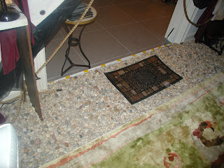
A media room is a very high-tech room. In many homes it means big leather chairs with drink holders on the armrests, but just look at this room. S.E.A.L. Solutions with Joe Ginsberg Inc created this warm, organic and inviting room. The photo above is a lighted entryway into the room. The rock area is on one level and a riser with a imbedded light creates a step where the Tibetan silk rug is resting. One step up takes you into a space engulfed in floor-to-ceiling canvas drapery that both softens and enhances the ultra-widescreen images and the surround sound auditory system built into the room. The softness of this room offsets the edges of the high-tech world. Just a fabulous room.
My other favorite was the dining room by Marshall Watts Interiors, but I don't have any pictures of this. My daughter did take pictures so you can view them on her blog: http://renewdesigns.blogspot.com/. The bee-hive chandelier along with the burlap border on the carpet give an organic feel to this room. However, Judy Mulligan's stenciled and English oiled walls were the topper for me. The color and design was just incredible and the most gorgeous artistic wall creation that I have ever seen.
I just can't wait to go next year.
No comments:
Post a Comment